Finding clues and solving puzzles to unlock more bookings
Updating the Trapped Downtown user experience
FREELANCE
ENTERTAINMENT

Challenge
Trapped Downtown needs to increase their revenue. They’ve tried marketing in a few places locally (including innovative ideas like adding QR codes on drink coasters at local breweries and sponsoring the pedal pub that runs downtown) but they haven’t seen a substantial enough increase in bookings to turn this hobby business into a revenue generating business.
Goal
Increase revenue through multi-prong approach to fresh marketing. This will include turning a non-responsive website into a mobile experience as well as continuing to implement innovative marketing activities.
Process
- Competitive analysis
- Heuristic evaluation of current website
- User interviews
- Card sort activity with users
- Identified actionable insights
- Reorganize information architecture and site map
- Mid-point check-in with stakeholders
- Sketched mobile-first wireframes
- Designed high fidelity prototype
- Conducted user testing and made modifications
- Worked with developer to implement new designs
Users want clarity
“This website is astonishingly unclear. How do I get to the place where I actually buy the ticket?”
-User
Interviews revealed four key insights:
- Make “Book Now” action easy to find
- Show WHO this experience is for
- Show external validation on website through reviews
- Remove group planning friction
Improved navigation enhances the user experience
Based on the user insights and the heuristic evaluation, key changes to the new site map included:
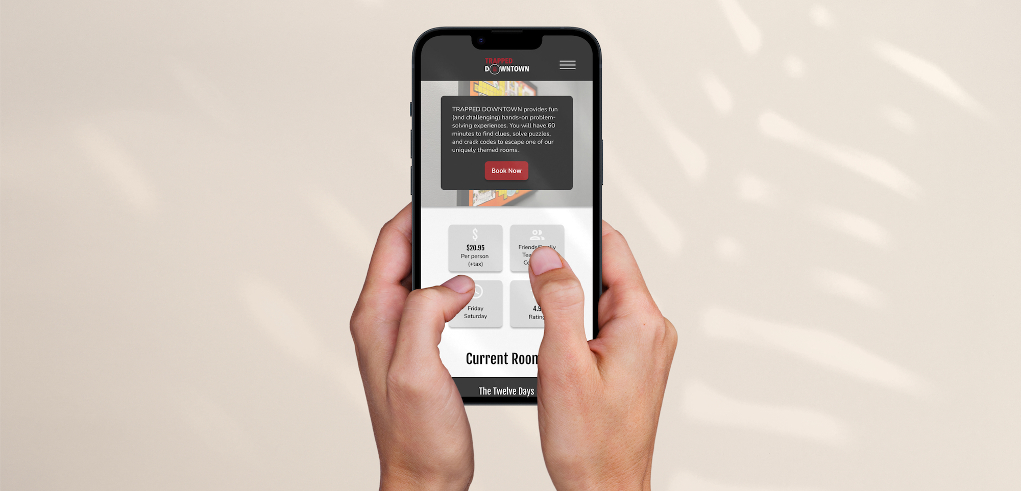
- Adding a homepage which gave users high priority information quickly (ex. price) and a Book Now CTA.
- Redesigning the Book Now CTA as a stand-alone button vs blending in with the other menu items.
- Streamlining content into three groups which enabled a ‘right information at the right time’ flow to the website.
- Updating the footer to add relevant information and quick links in order to help users navigate the website.
Impact
I worked with a developer to implement the designs. The redesigned website launched on May 3rd and resulted in a 16% increase in unique visitors in the following 2 months (comparing June/July 2023 to June/July 2024) and a 46% increase in bookings in the same period.
“The website redesign gives us a renewed sense of excitement for our business's potential growth!”
- Courtney, Trapped Downtown Owner
Key Takeaways
Stakeholder understanding
The stakeholder had a pivotal aha! moment when I showed the competitors' mobile homescreens next to Trapped Downtown's mobile homescreen - they were able to step out of their understanding of their own website and really get in the user's shoes and see it with fresh eyes.
Getting curious
After completing the project, I spent time exploring other analogous websites for interactive events (ex. Meow Wolf). I became more curious and learned that this type of analogous exploration could really strengthen my design process.
Key technologies/skills
- Card Sort
- Competitive analysis
- Figma
- Heuristic evaluation
- Information architecture
- Prototyping
- User Interviews
- User Testing