Searching for the perfect cup of cold brew
Designing Little Cup, a responsive website
CASE STUDY
SOCIAL
CONSUMER SERVICES
Challenge
I am passionate about cold brew coffee and find joy in searching out new coffee shops in the Twin Cities and wherever I am traveling! Unfortunately, finding crowd sourced reviews specifically about cold brew is very difficult. Every car dealership and hotel lobby advertises that they have coffee but I don’t want just any old cup of joe, I want cold brew!
Goal
I want to be able to search for cold brew coffee and ignore the coffee shops that don’t have cold brew. This will also allow me to connect with other cold brew lovers in the community.
Process
- Competitive analysis
- User interviews
- Identified user pain points
- Built site map
- Sketched responsive wireframes
- Built low fidelity wireframes
- Designed high fidelity mockups
- Multiple rounds of user testing
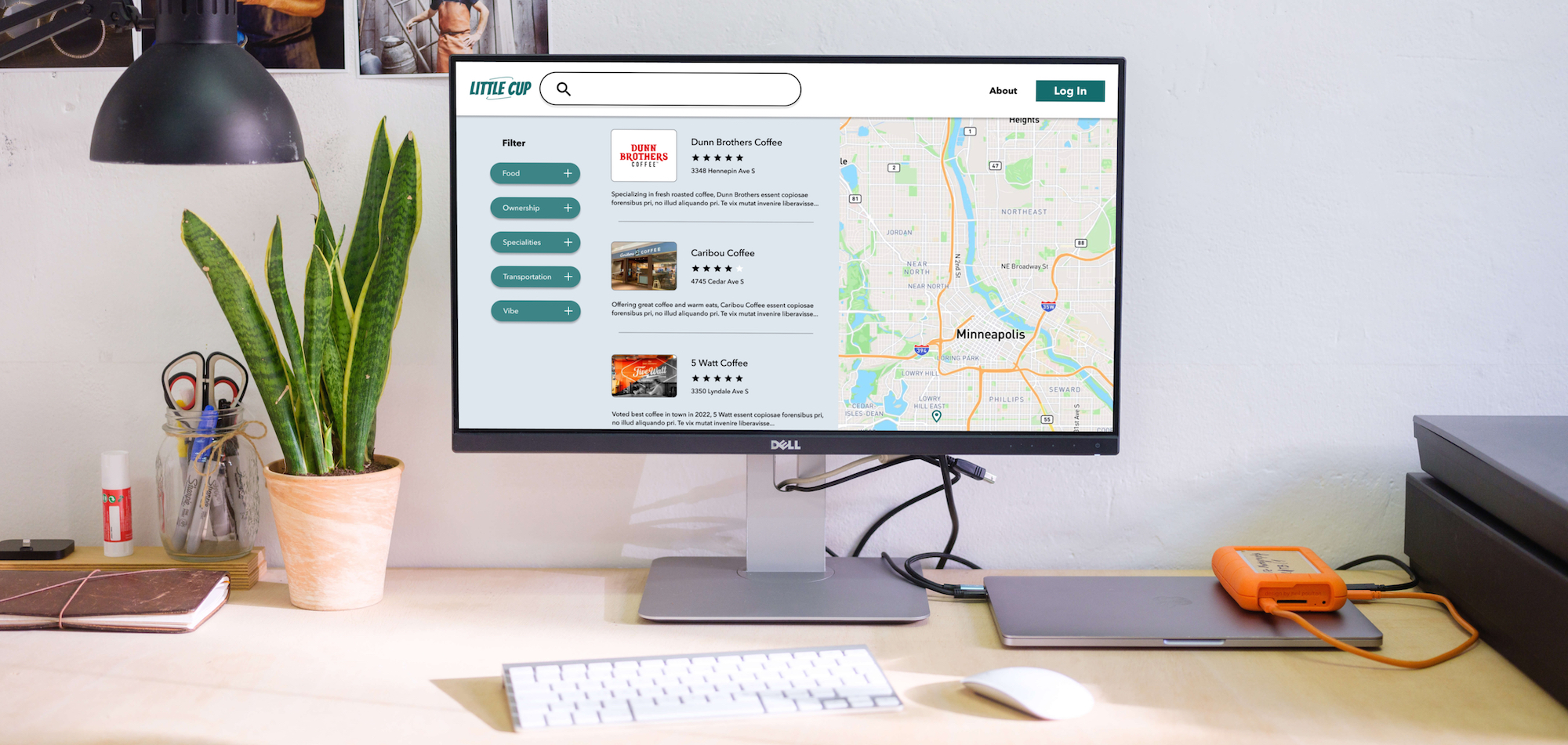
From Overwhelming to Efficient: Ensuring the User has tailored filters and a tidy map.
To evaluate the current options available for finding coffee shops, I conducted a competitive analysis. This allowed me to gain a deeper understanding of both the benefits and pain points a user experiences in their search. I chose two popular sites that rely on user-generated reviews (Classpass, Yelp) and then I found a less robust site that was laser focused on local coffee shops but didn’t have the usability that I knew was possible (Find Me Coffee).
Pain Point #1
Maps are cluttered making it an overwhelming user experience.
Opportunity #1
The design of the map will need to be clear and compelling.
Pain Point #2
Users want to be able to filter for specific items.
Opportunity #2
Tailored filters will attract and retain users.
Filters set Little Cup apart from competitors
Food
- Fresh baked goods
- Serves hot food
Ownership
- Independent
- Women/BIPOC/ LGBTQ+
Specialities
- Cold brew
- Matcha
- Roaster on-site
Transportation
- Bike rack
- Drive-through
- Parking
Vibe
- Allows pets
- Wifi
Multiple rounds of user testing
I learned that the Call to Actions in the Navigation Bar weren’t helpful to users, so I moved those to be in context with the content. When I started designing the log-in modal, I made some visual design decisions that my interviewees didn’t agree with so I simplified those. I also simplified the filters from a drop down menu to a static header and list.
Interviewees were curious about the site but wanted additional information so I added the tagline “Find your next cup of coffee!”*
*Note to self: for passion projects, source users with the same passion ;)
Next steps to strengthen the product offering
- Evaluate the benefits of offering log-in creation and storage.
- Test blog-like content to see if users engage with it, as seen on The Infatuation website.
Key Takeaways
Language matters
Language for filters is important and ideally more testing would be done to validate the current choices as well as adding filters based on popular searches.
Context matters
Call to action buttons need to be in context. “Write a Review” doesn’t make sense without the context of a specific shop or product to write the review about.
Key technologies/skills
- Figma
- High fidelity mockups
- Information architecture
- Prototyping
- Usability testing
- Wireframing